
Bieon — Brand Identity for a Bioenergy Company
Overview
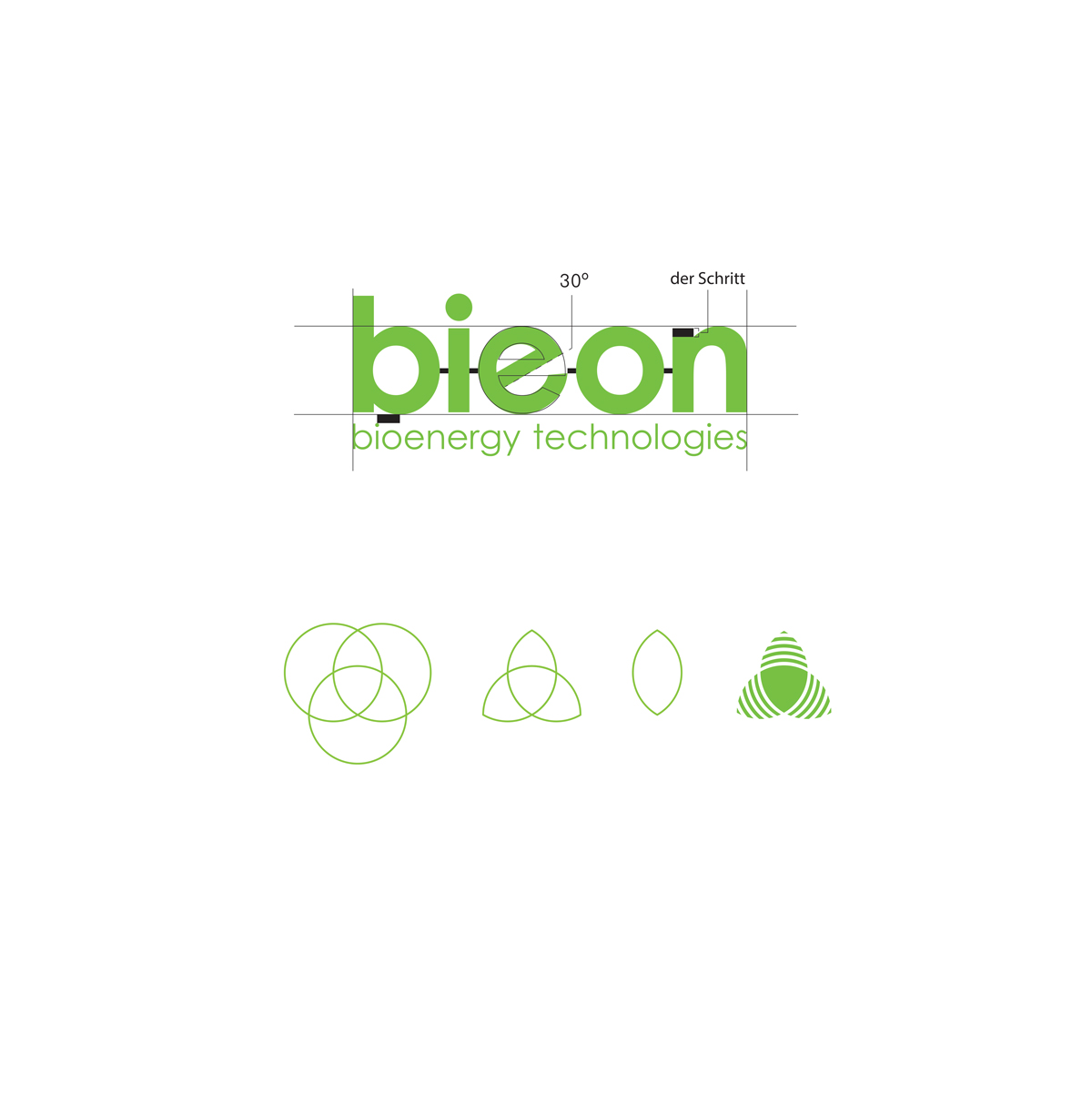
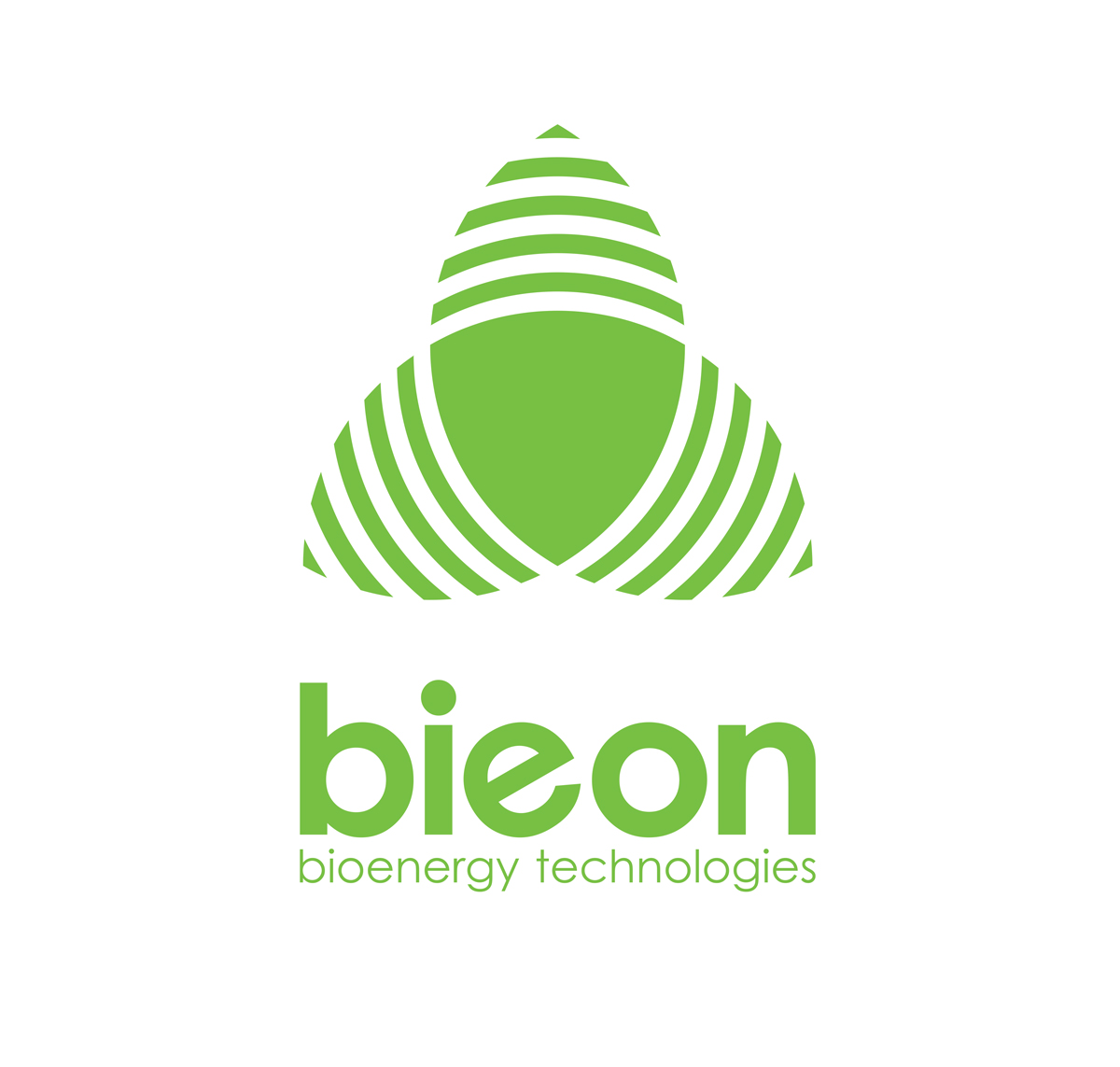
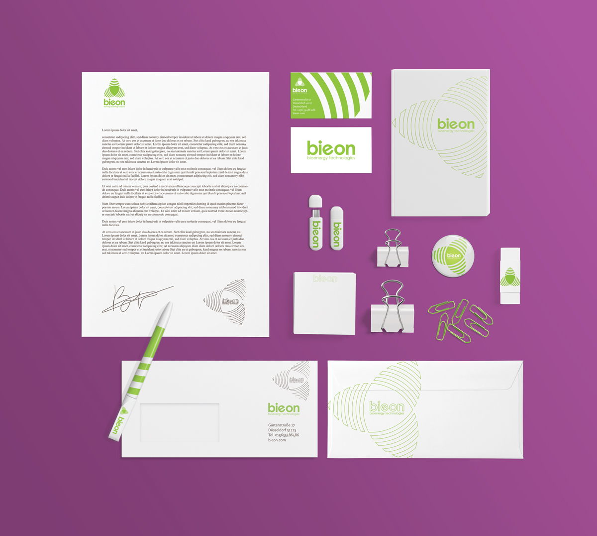
Brand identity for Bieon, bioenergy technologies. The logotype is drawn on a strict geometric grid — the counter of the e is cut at 30 degrees — and the symbol grows out of three intersecting circles into a leaf. One green, one weight, no decoration.